 ES-DE Overlay
Theme
The look follows your ES-DE theme
The menu, the guide viewer and the guide browser take their colours and font from the ES-DE theme in use. They also follow the variant, colour scheme, font size and aspect ratio set in ES-DE. Each part comes from a part of the theme’s gamelist:
- the rows and the cursor from its text list;
- guide text from its game description text;
- the help pill from its help prompts;
- the background from its background. A wallpaper picture counts as its average colour.
The overlay keeps its own layout and draws solid colours, not the theme’s images. Change the theme in ES-DE and the overlay follows from the next game you start.
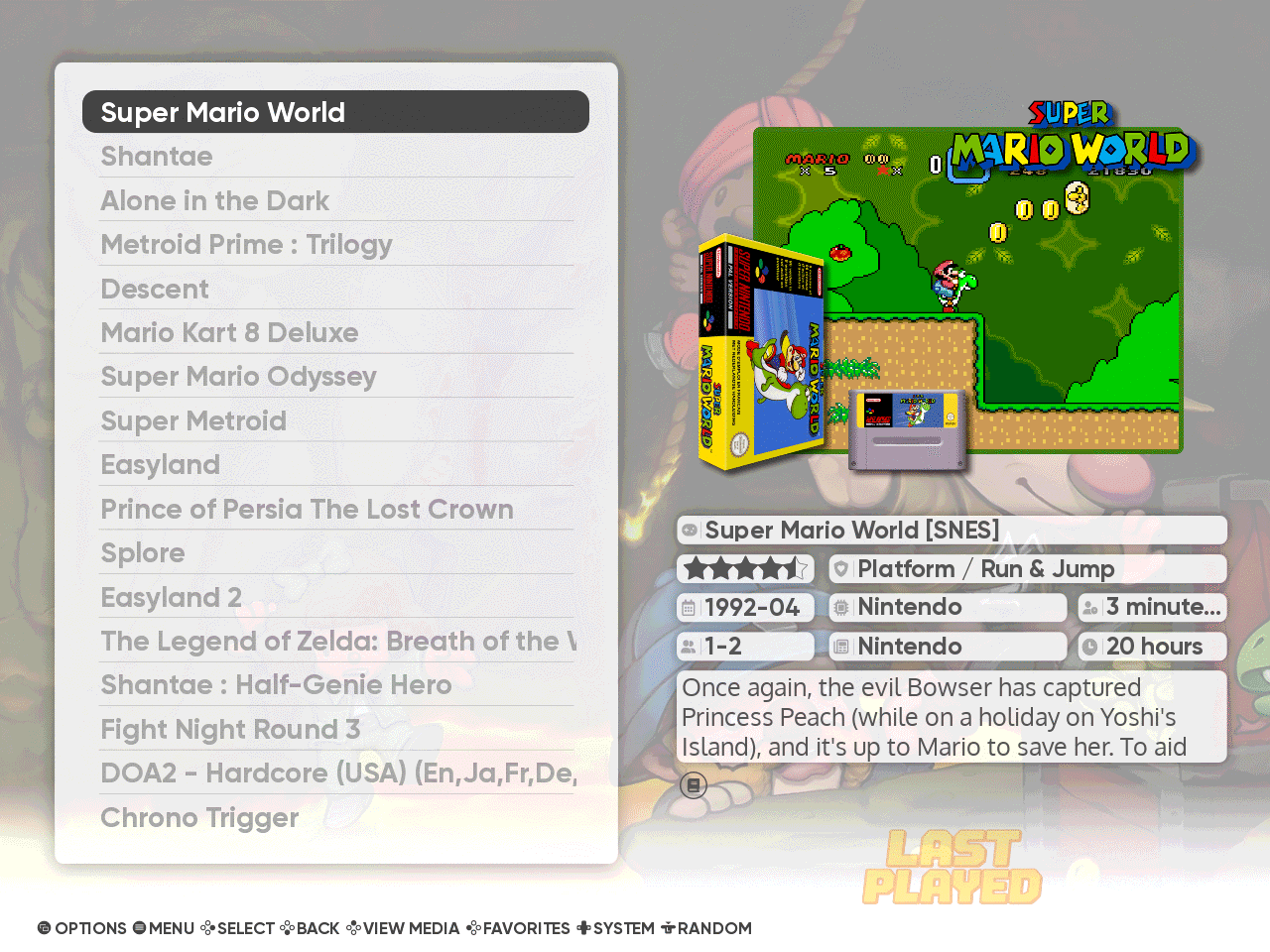
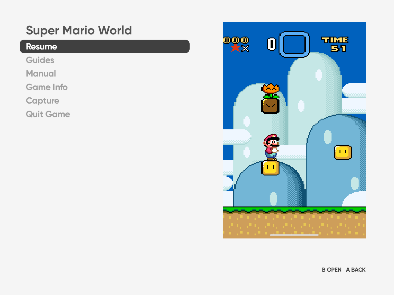
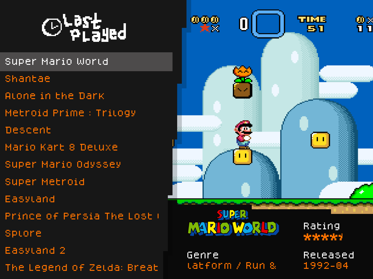
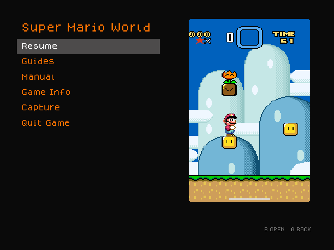
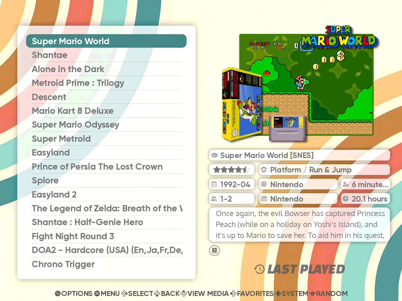
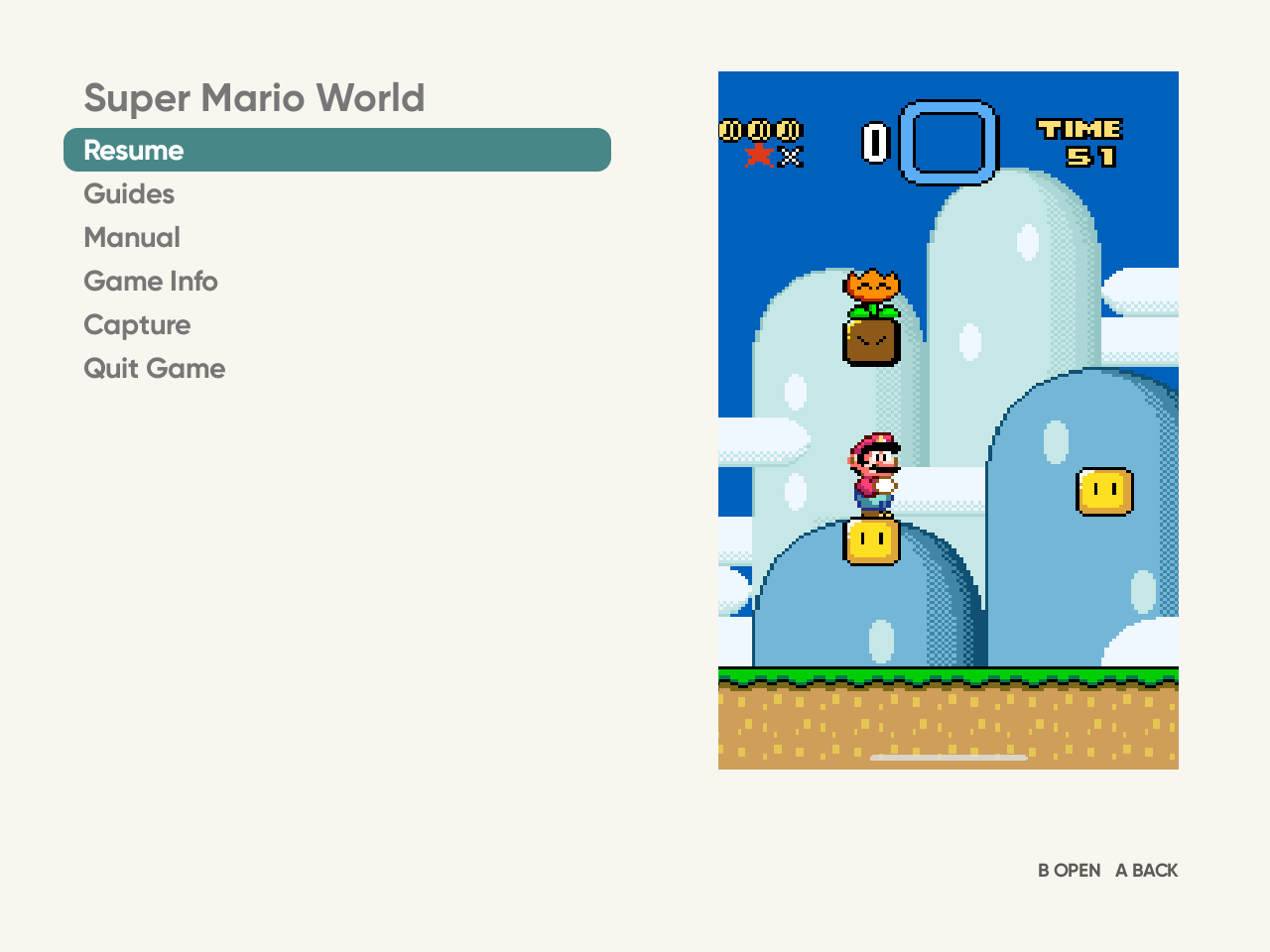
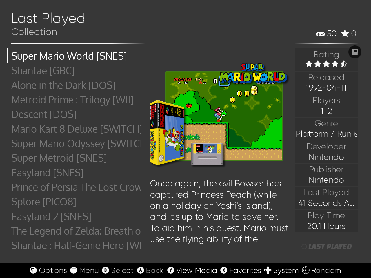
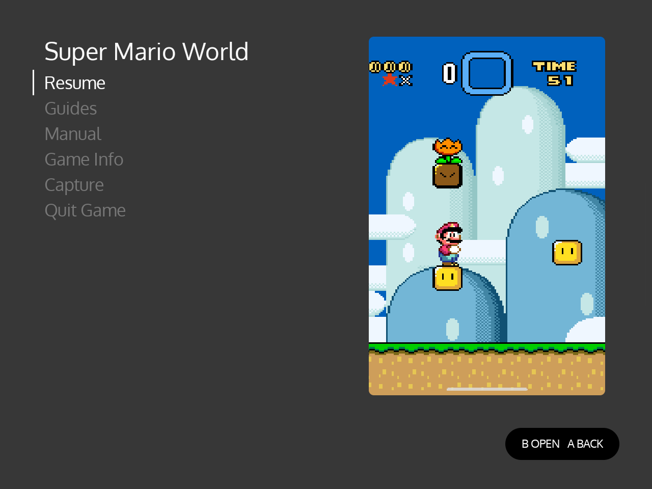
Six themes, each with ES-DE’s own gamelist on the left and the overlay’s menu on the right:
| ES-DE’s gamelist | The overlay’s menu |
|---|---|
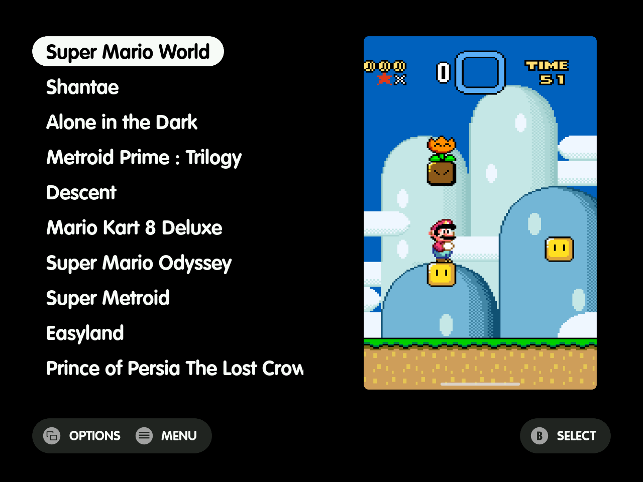 |
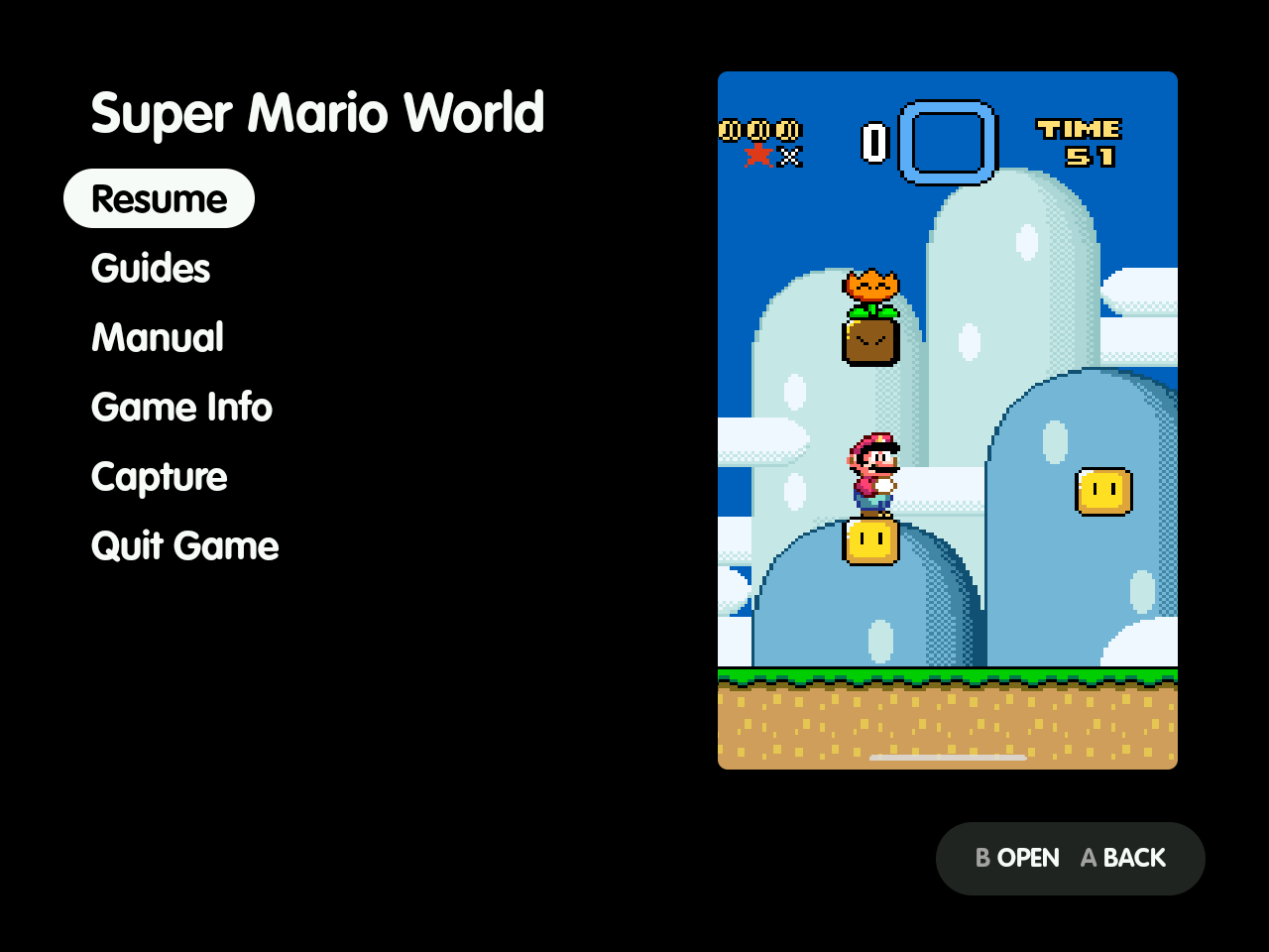 |
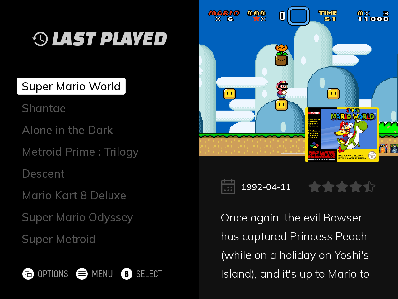 |
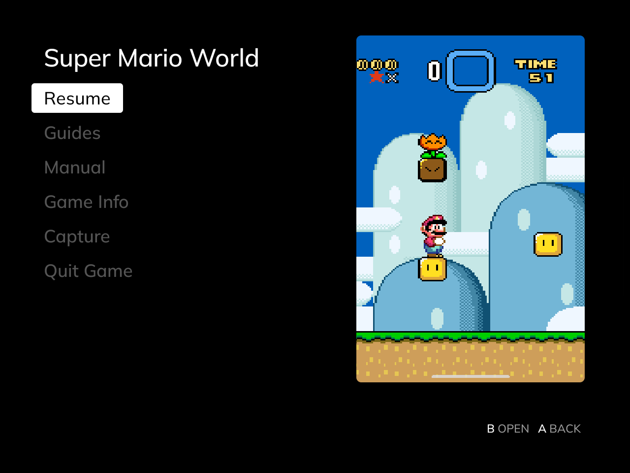 |
 |
 |
 |
 |
 |
 |
 |
 |
Where it reads the theme from
- Themes in
ES-DE/themes/: any theme there works. - Themes from ES-DE’s theme downloader: these live in ES-DE’s own app storage, which other apps can’t read. The overlay reads them through Shizuku, copying a theme’s XML, font and SVG files when a game starts after the theme changed.
- Without Shizuku, copy the theme’s folder from
Android/data/org.es_de.frontend/files/themes/intoES-DE/themes/. Do it from a computer over USB, for example, since Android keeps most file managers out of that folder. - Copy it again after the theme updates.
- Without Shizuku, copy the theme’s folder from
- Themes built into ES-DE, such as Linear: read from ES-DE’s app, so their colour scheme and fonts follow too.
If ES-DE itself can’t be read, the overlay uses a default look in Linear’s dark colours with the system font.
The Look settings
In ES-DE Overlay’s settings, under Look:
- Theme says which look is in use. It shows the theme and colour scheme it follows, or the default look and why, or
overlay-theme.xml overeither. - Text size scales the theme’s text in the menu and guides, from 90 % to 200 %. It’s for themes whose small text suits ES-DE’s busy screens but reads small in the overlay. The menu takes it from the next game you start.
overlay-theme.xml
To change any part of the look, put an overlay-theme.xml in the ES-DE folder, the one that holds downloaded_media. It overrides only the values it names; the rest still follow the theme:
<overlay>
    <background>102030</background>
    <selectedText>FFFFFF</selectedText>
</overlay>
- A value that doesn’t parse is ignored, and so is a key not in the table below.
- Changes show from the next game ES-DE starts.
- Colours are written as ES-DE writes them:
RRGGBB, orRRGGBBAAwith transparency. - Sizes are fractions of the screen, so
0.04is 4 %.
| Key | What it sets | Value |
|---|---|---|
background |
The background of the menu, the viewer and the browser | colour |
text |
The rows’ text | colour |
selectedText |
The selected row’s text | colour |
selectedBackground |
The cursor’s pill, as wide as the selected row’s text | colour |
selectedCornerRadius |
The pill’s corners | fraction of the screen width |
selector |
The cursor’s bar, under the pill | colour |
selectorWidth |
The bar’s width. Below 0.05 it’s a thin bar at the row’s left, like Linear’s; wider, or left out, the bar covers the row |
fraction of the screen width |
selectorCornerRadius |
The bar’s corners | fraction of the row’s height |
helpBackground |
The help pill’s background | colour |
helpIcon |
The help pill’s button icons | colour |
helpText |
The help pill’s text | colour |
fontPath |
The rows’ font, a TTF or OTF file | path below the ES-DE folder, e.g. fonts/list.ttf |
fontSize |
The rows’ text size | fraction of the screen height |
lineSpacing |
The rows’ line spacing | multiple of fontSize |
bodyText |
Guide text | colour |
bodyFontPath |
Guide text’s font | path below the ES-DE folder |
bodyFontSize |
Guide text’s size | fraction of the screen height |
bodyLineSpacing |
Guide text’s line spacing | multiple of bodyFontSize |
artCornerRadius |
The game art’s corners | fraction of the screen width |
textScale |
Both text sizes, after the values above; the Text size setting then applies on top | percentage, e.g. 125 |
Font paths can’t start with / or contain ... A path into a theme’s folder works too, e.g. themes/<theme>/<font file>.
Here is an example that sets every key. You can also download it:
<?xml version="1.0" encoding="UTF-8"?>
<!--
  An example overlay-theme.xml for ES-DE Overlay. Save it as overlay-theme.xml in
  your ES-DE folder, the one that holds downloaded_media, and delete the lines you
  don't want. Each line replaces one value the overlay takes from your ES-DE theme;
  the rest still follow the theme. Changes show from the next game ES-DE starts.

  Colours are RRGGBB or RRGGBBAA, as in ES-DE's themes. The font paths name font
  files below the ES-DE folder, here a fonts folder you make there; delete those two
  lines to keep the theme's fonts. Every key is described on the Theme page:
  https://clintonium-119.github.io/es-de-overlay/theme.html
-->
<overlay>
    <!-- The rows and the cursor: a thin bar at the left and a faint pill. -->
    <background>F2F0E6</background>
    <text>4A4A4A</text>
    <selectedText>1E4E66</selectedText>
    <selectedBackground>2E6E8E33</selectedBackground>
    <selectedCornerRadius>0.01</selectedCornerRadius>
    <selector>2E6E8E</selector>
    <selectorWidth>0.004</selectorWidth>
    <selectorCornerRadius>0.5</selectorCornerRadius>
    <fontPath>fonts/overlay-list.ttf</fontPath>
    <fontSize>0.04</fontSize>
    <lineSpacing>1.6</lineSpacing>

    <!-- The help prompts at the bottom. -->
    <helpBackground>DDDACC</helpBackground>
    <helpIcon>2E6E8E</helpIcon>
    <helpText>4A4A4A</helpText>

    <!-- Guide text. -->
    <bodyText>202020</bodyText>
    <bodyFontPath>fonts/overlay-guide.ttf</bodyFontPath>
    <bodyFontSize>0.03</bodyFontSize>
    <bodyLineSpacing>1.4</bodyLineSpacing>

    <!-- The game art's corners, and all text 10 % larger. -->
    <artCornerRadius>0.008</artCornerRadius>
    <textScale>110</textScale>
</overlay>
The theme in the screenshots
The screenshots use MinUI Menu (Overlay). It’s a fork of Anthony Caccese’s minui-menu-es-de, itself a port of Shaun Inman’s MinUI menu. The fork changes:
- List spacing: tighter at font size Small, so ten whole rows fill the list.
- Scrolling names: a name too long for its row scrolls after 1 second.
- Game art: taller, placed higher, and filling its box, with rounded corners on 4:3 screens.
It keeps upstream’s Creative Commons BY-NC-SA licence.
To use it:
- Put it in ES-DE’s themes folder as
ES-DE/themes/minui-menu-overlay-es-de/, by cloning it there or by downloading the ZIP and renaming the folder. - Restart ES-DE.
- In UI Settings, set:
| Setting | Value |
|---|---|
| Theme | MinUI Menu (Overlay) |
| Theme variant | List: Screenshot |
| Theme color scheme | Dark (Bold Font) |
| Theme font size | Small |
| Theme aspect ratio | Automatic |
These are the settings on the Retroid Pocket Nova in the screenshots. Use Small. This fork tightens Small’s line spacing so ten whole rows fill the list, which keeps ES-DE’s scroll jumps landing on full rows.
Of the other five themes above, Art Book Next, Iconic, TechDweeb and Canvas come from ES-DE’s theme downloader, and Linear is built into ES-DE.